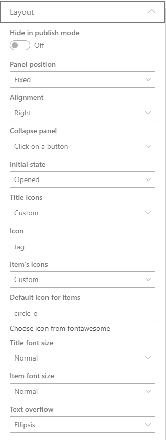
Hide in publish mode
Turns off the visibility of the web part in publish mode.
Panel position
Choose panel's position on the page
- Web Part zone - the panel will be placed inside the web part's section
- Fixed - the panel will be placed on a fixed position even when the user is scrolling the page
Alignment
Choose where the fixed panel will be anchored
- Left
- Right
Collapse panel
Choose the behavior to close (collapse) the panel
- Click on a button
- Click on a button or outside the panel
Initial state
Choose the panel's intial state, when the page is loaded.
- Opened
- Closed (Collapsed)
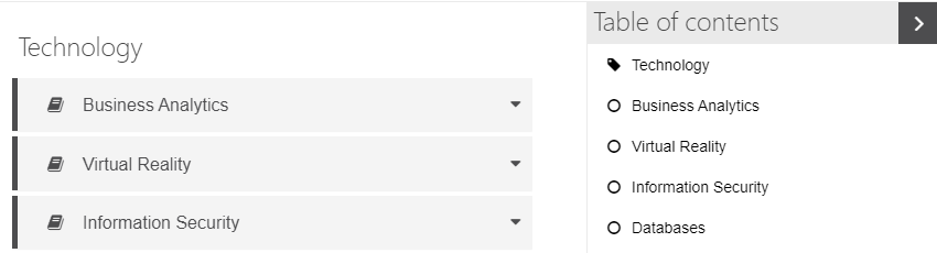
| panel state | |
|---|---|
| opened panel | 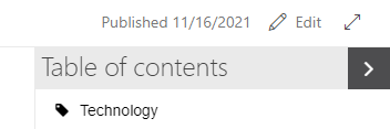 |
| collapsed panel |  |
Title icons
Choose an icon for the headings
- None
- Custom - choose an icon from FontAwesome
Item's icons
Choose an icon for the items
- None
- From Web Part - use the same icons of the web part's items
- Custom - choose an icon FontAwesome
example using custom icons from FontAwesome. A "tag" icon for web part title and a "circle-o" icon for the items
Title font size
Choose icon to the text size for the titles
- Small
- Normal
- Large
Item font size
Choose icon to the text size for the items
- Small
- Normal
- Large
Text overflow
Choose the behavior when the text doesn't fit on the panel's width
- Ellipsis
- Break line